Hi guys! So today I’m sharing some more IG & blogging tips! If you’re newer here, I have a whole blog section dedicated to IG, blogging, turning your side-hustle in your full-time job, plus more. But today I wanted to talk about some tips for establishing a cohesive IG feed.
I’ll first say that I think overly curated feeds are overrated. This is just my opinion but over the years you can see that there has been more of a trend in people sharing less curated, less filtered, and more “in the moment” photos versus when IG first started. When IG first started there were a lot more photos where it was like “Oh, I’m just walking on the street, and there’s flowers sticking out of my purse!” If that’s what you’re into, nothing wrong with that! But my point here is, social media has gravitated away from those more curated moments and in my opinion, you don’t need to stress about having the “perfect” feed. However, I totally understand wanting to have some sort of cohesiveness and overall vibe to your feed. After all, it is a representation of your personal brand!
So one way to ensure a cohesive feed is to limit yourself to strictly only wearing certain colors. Don’t worry, this isn’t what I’m suggesting but I feel like I need to give you all the options 😉 When you do this consistently, the backgrounds aren’t as important to establishing a cohesive feed because the the main subject (you) is consistent; you tie everything together. But when looking for backgrounds you will probably still establish certain “ground rules”. This totally works for some people but for me, even though I tend to wear a lot of black (and really more neutrals), I’m not always in neutrals and don’t want to feel like I always have to be (or always have to be in 1-2 colors for that matter) in order for things to look cohesive.
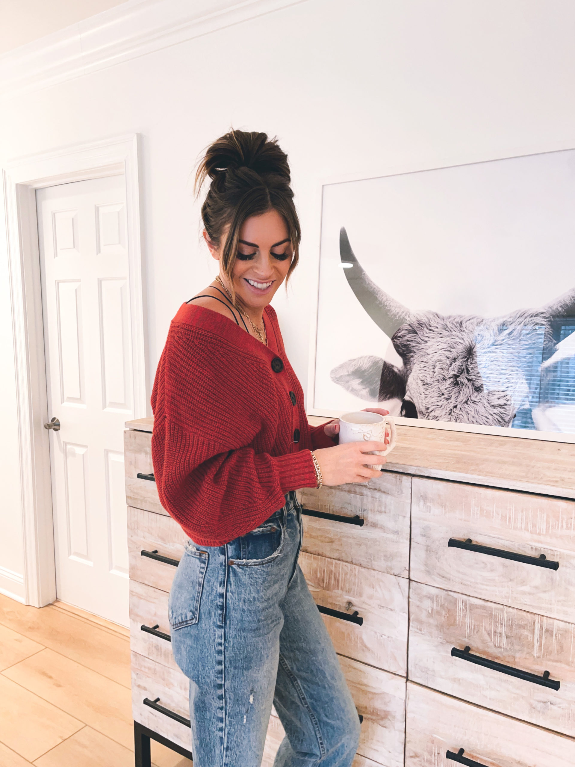
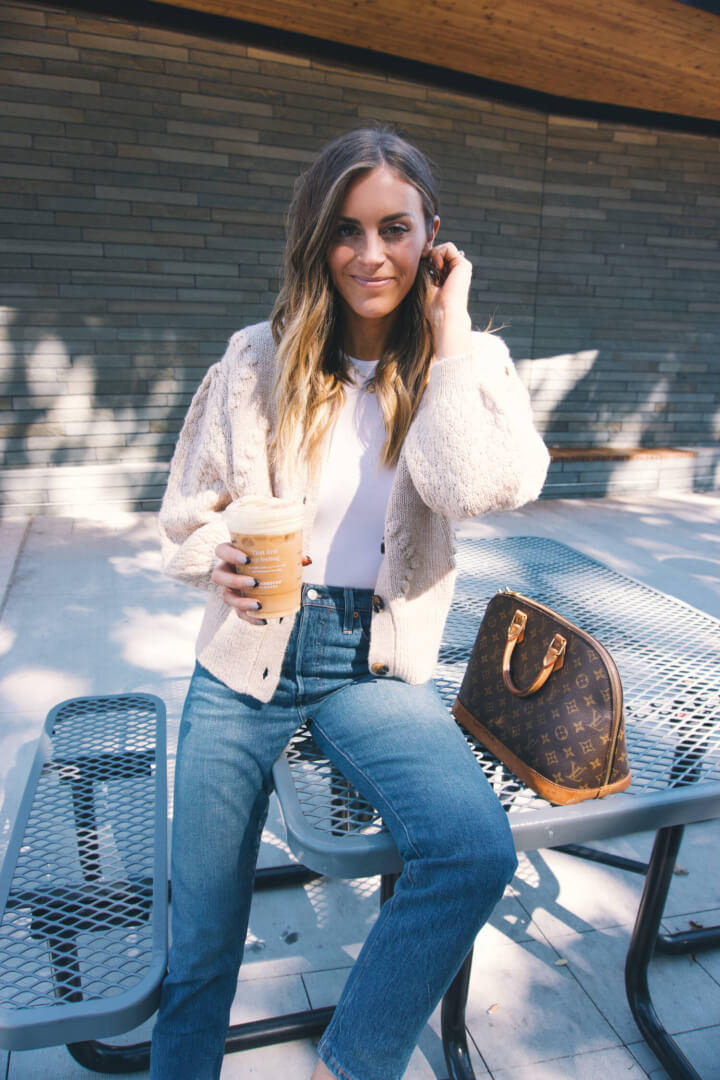
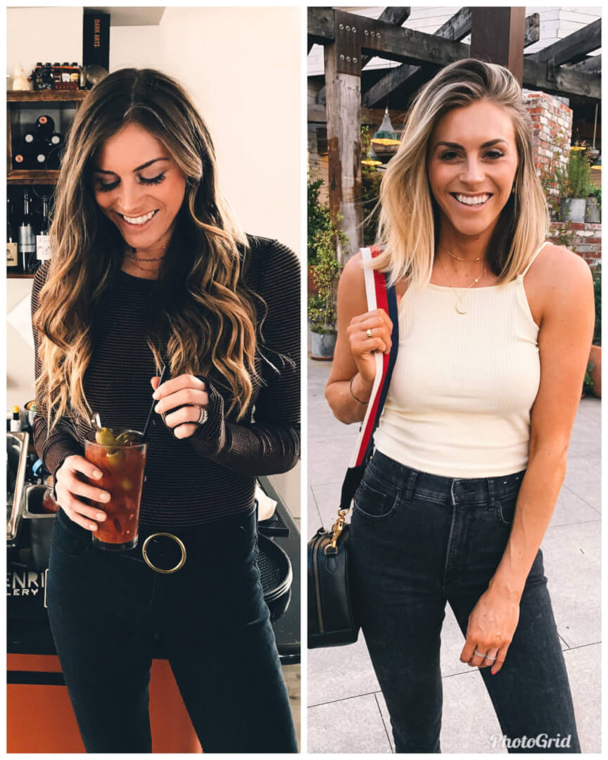
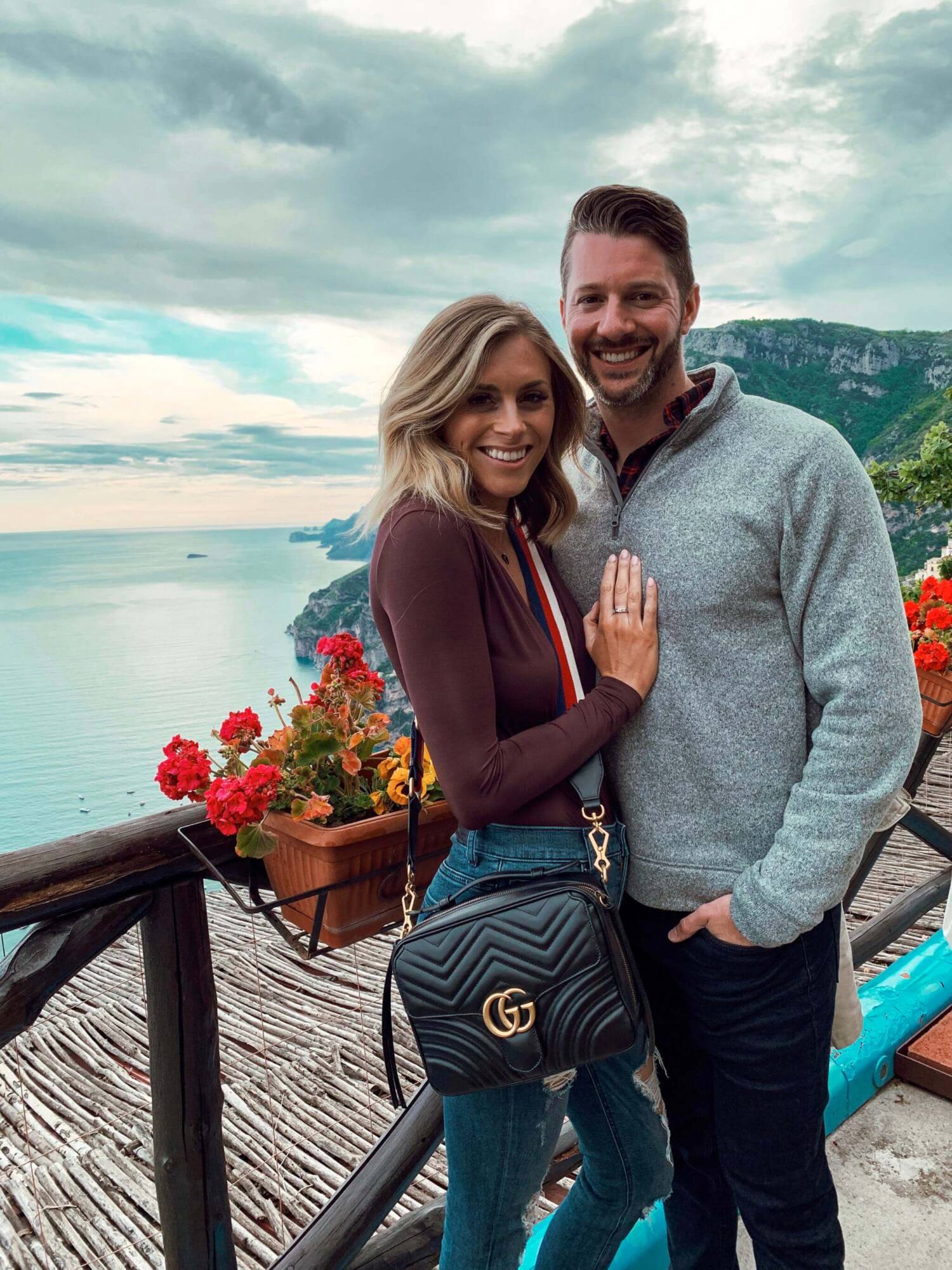
That being said, what I find to be most realistic while still giving you an overall cohesive look, is to plan your feed in “sections” or “grids.” That way, you don’t always have to be photographed in just 1-2 colors/shades of clothing but the colors or patterns that you are wearing are cohesive, and flow with the photos directly around it. So in my case, I usually wear neutrals but when I don’t, the colors that I do wear/post are the same color or similar shade in that section of my grid so things flow better overall. Let me show you some examples of what I mean below!
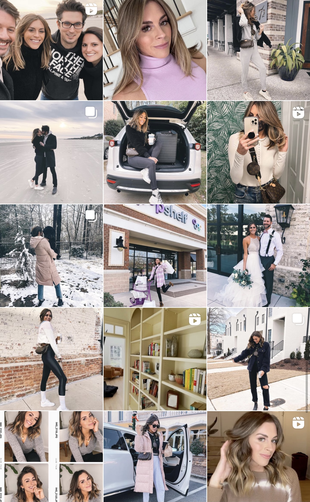
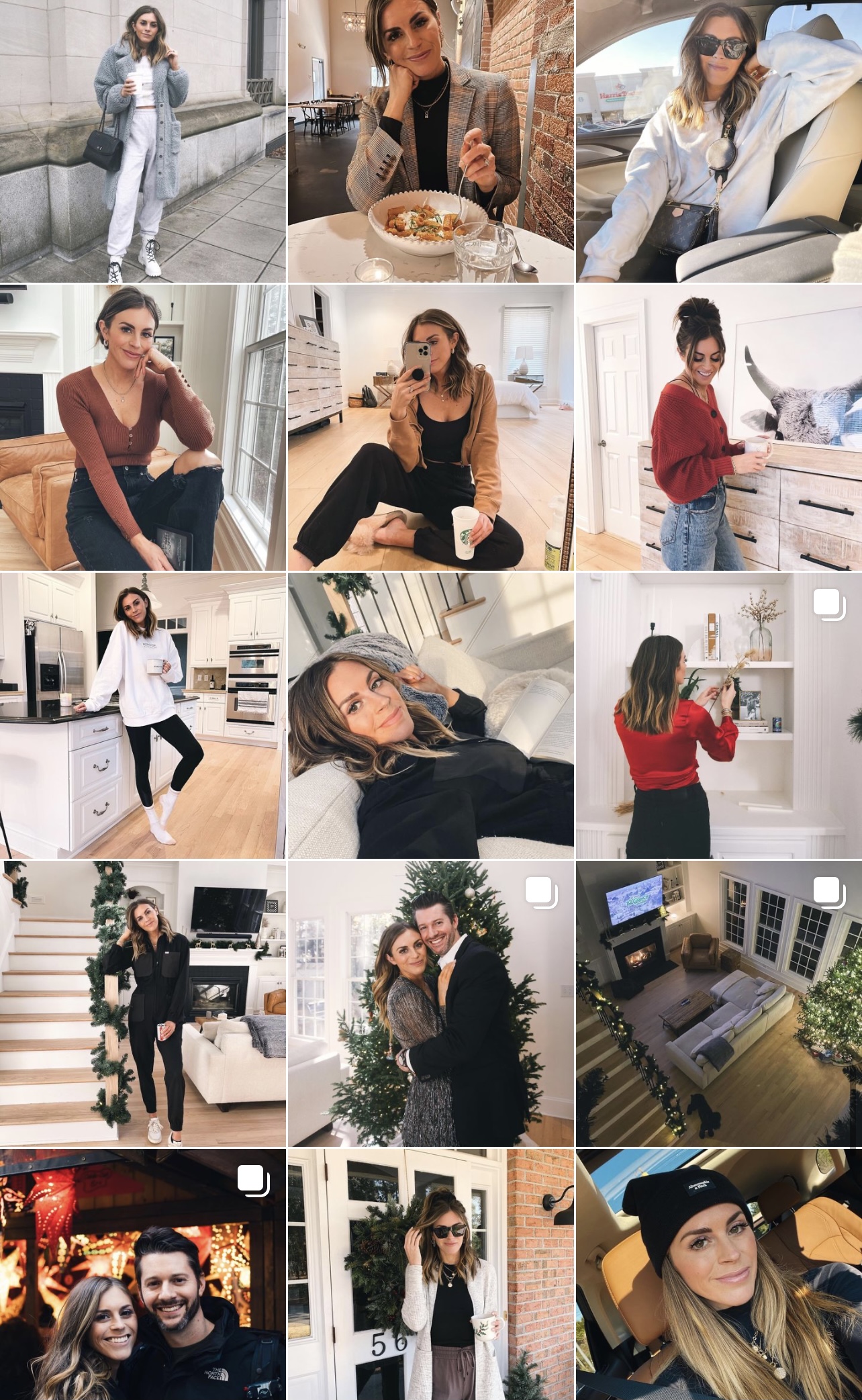
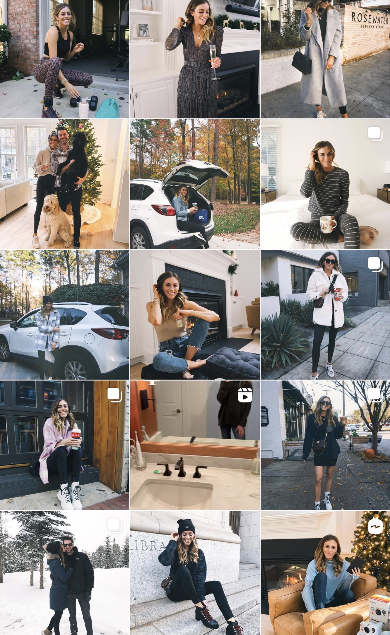
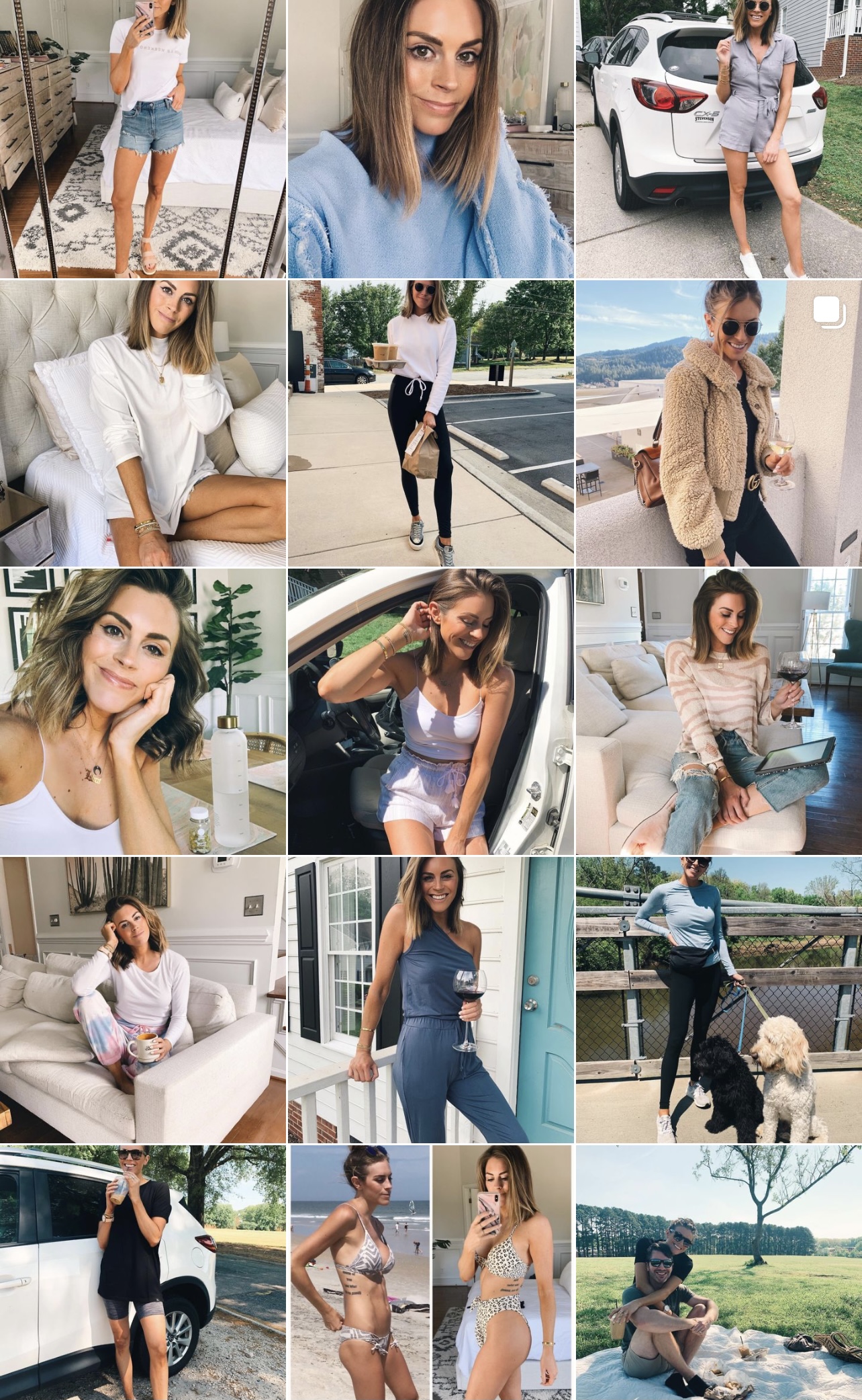
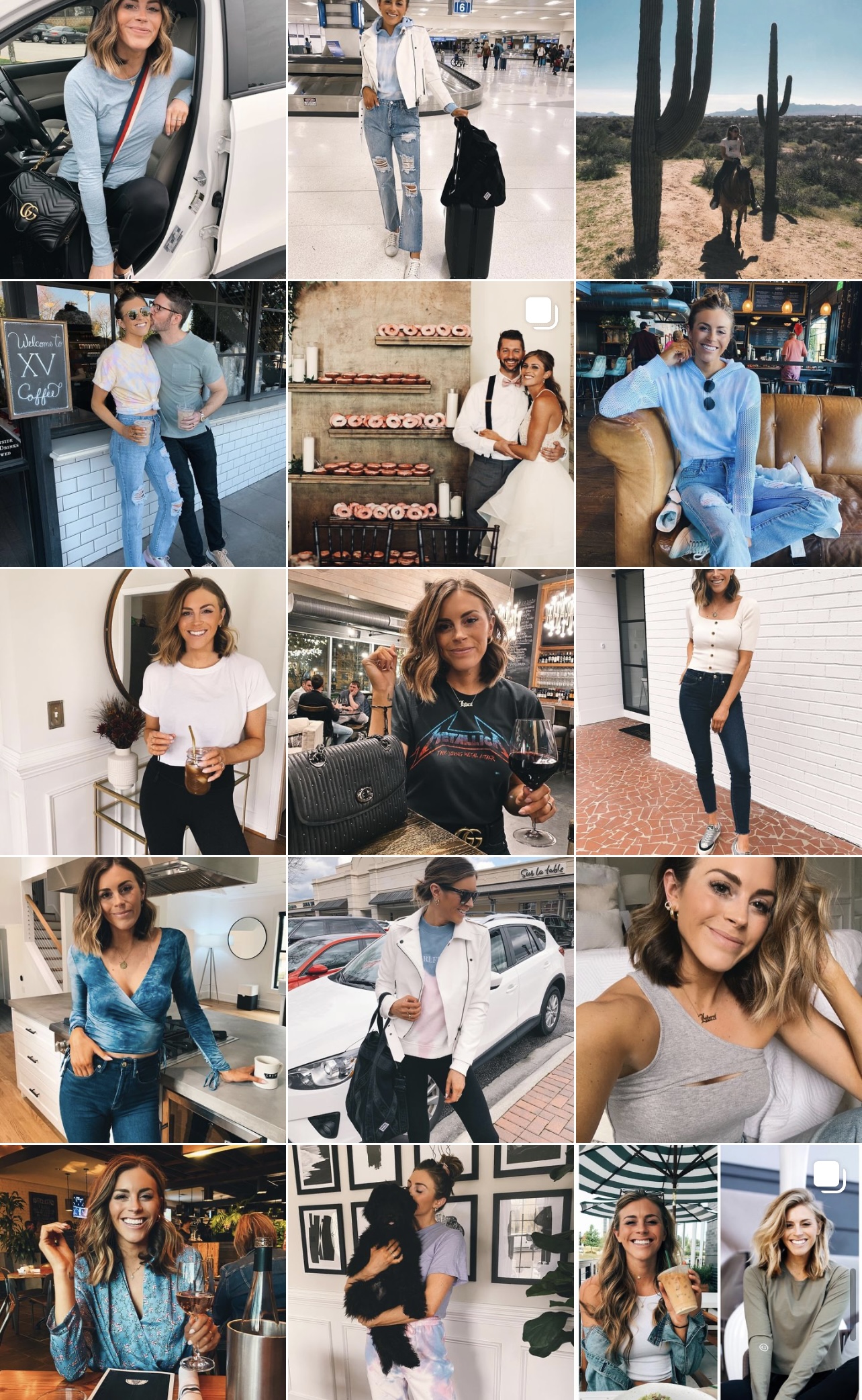
In doing this, I’m never really super focused on the background because I know that the colors in my outfits will help tie everything together. You can see my feed isn’t overly curated by any means. It still feels “in the moment” but has some intentionality and branding behind it.
Before I wrap up this post, something else to consider with backgrounds. Even though I’m not super strict with what is in the in background, there are a couple things to consider. One is, know what you like/don’t like. In the sense that, I personally don’t love red brick and it tends to not go with the overall aesthetic of what I want for my feed. This isn’t always avoidable but when when taking photos, I try to find locations that are more “neutral” and not as “red” lol. In doing this, the backgrounds will inevitably blend better together on your feed then having a couple random photos stick out like a sore thumb. The other thing to think about is when you’re posting, try to place photos with subjects and backgrounds that balance each other out. Let’s take a section of the grid I posted above as an example:
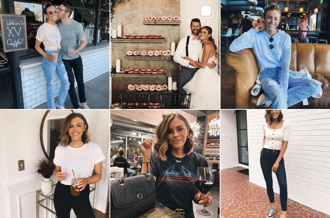
In the first row, you can see that the backgrounds in the photos on the edges are darker/heavier and I’m wearing jeans/blue tones in both photos. Having them on either side of the lighter, more neutral photo (our wedding picture) helps the grid feel more balanced. In the three photos below, the two photos on the edges have white backgrounds, and I’m wearing a white top with darker pants. Having this on either side of a photo with an overall darker composition (of me holding the wine glass) helps create overall balance and symmetry.
Okay guys, I think that is about it! Hopefully these tips help you build a feed/grid that you really love and feels like it resembles your personal brand (without going crazy that you can only wear one color or only take photos in front of white/neutral backgrounds haha). Any other suggestions or questions, feel free to leave below!

Claire, thanks so much for sharing this. I didn’t even realize that I curating my feed until way later. I love your feed and how clean it looks. Always dropping gems.