


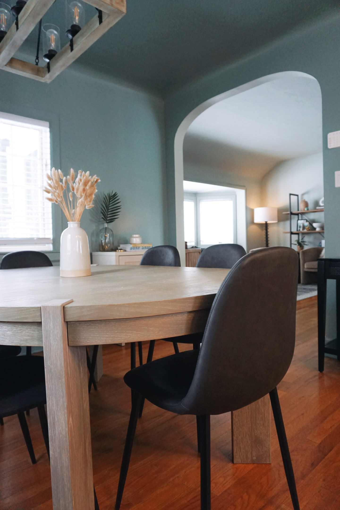
So. Let me preface this post by saying I genuinely love this color (Make Waves from Clare Paint). Not only do I really like this color but Clare paint was a dream to paint with (literally *so* easy, zero VOC, affordable for a premium product, deliver paint supplies to you, etc). They are also Black-owned so love to support their business as well.
However, I’m repainting *insert big sigh*
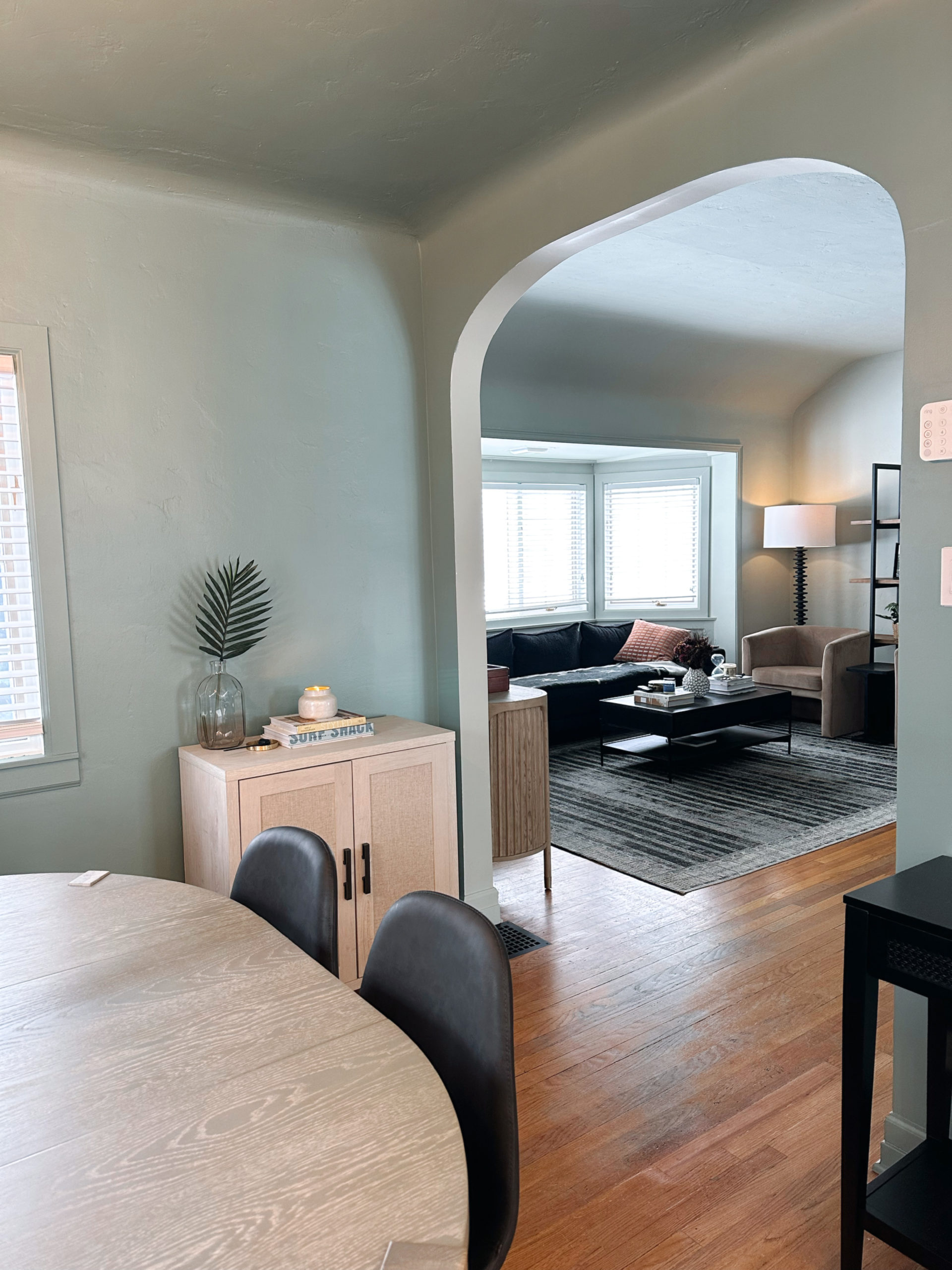
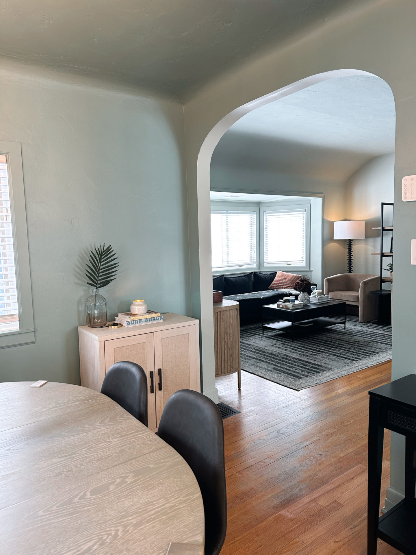
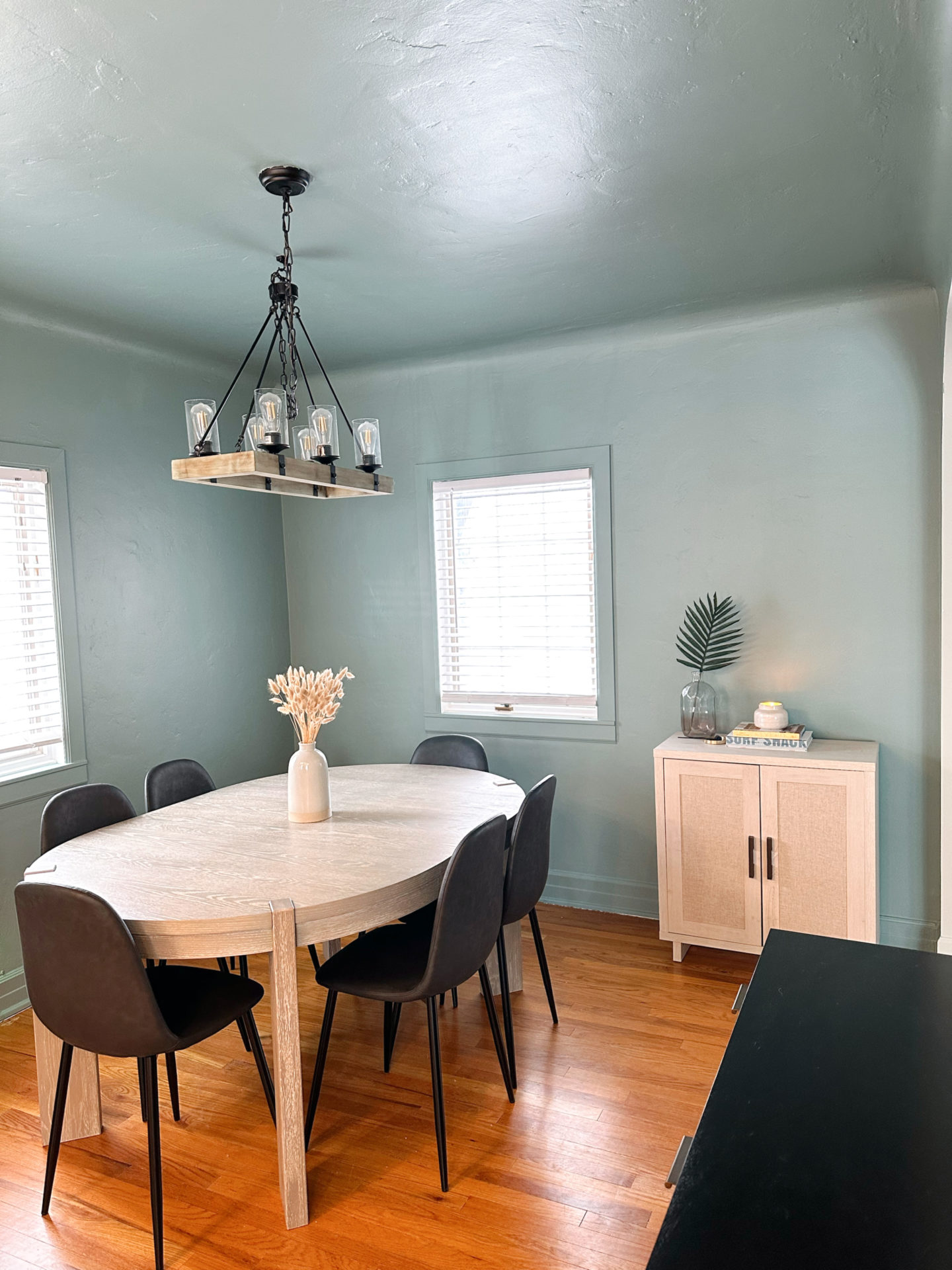
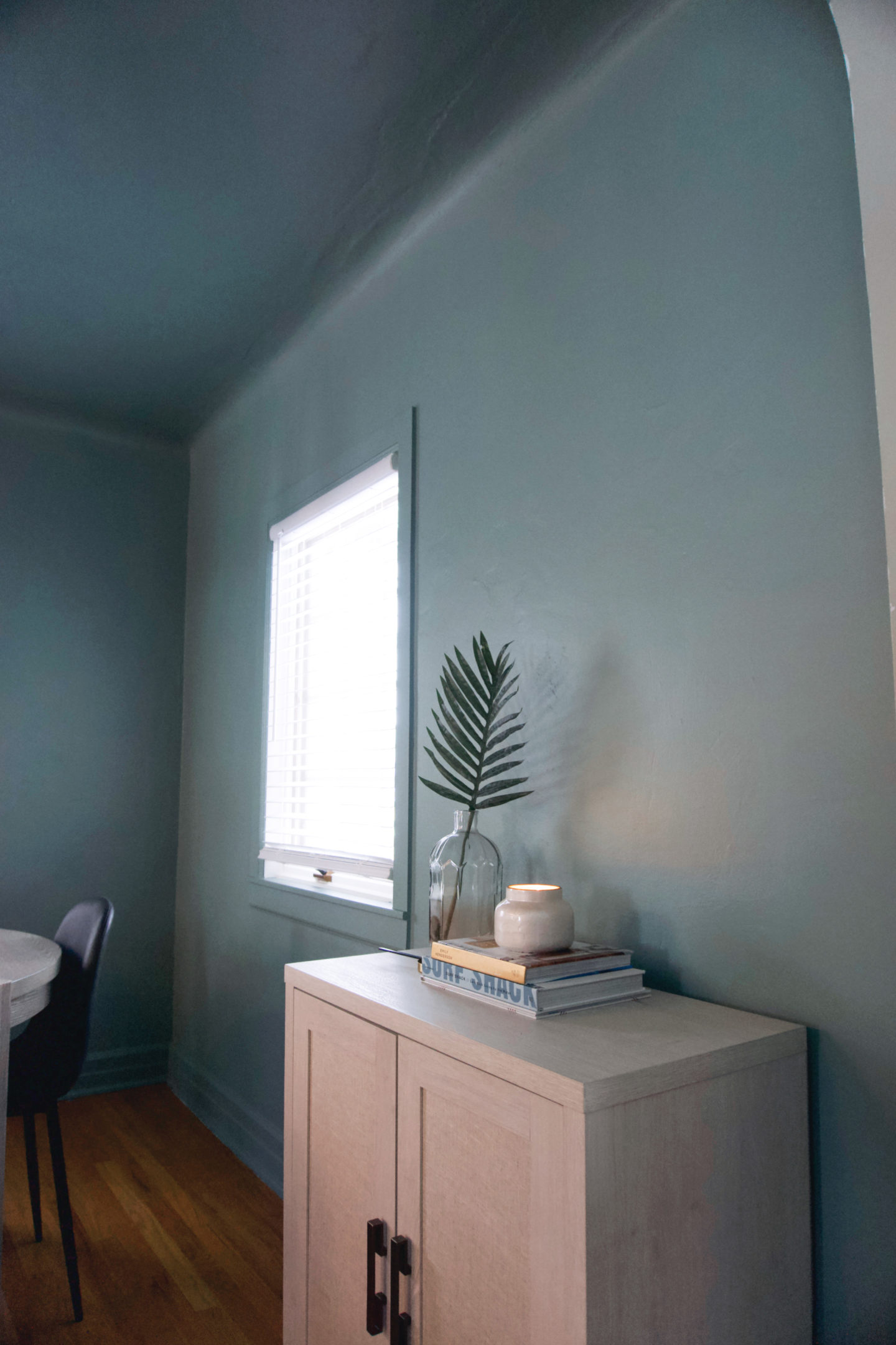
Before we dive into this. Let’s take a moment for the current dining area. Also, I think it looks great in photos but 1. that is the power of slight editing tweaks (like bringing up the exposure), and 2. how the camera picks up the color in certain spots vs. how it looks when I look at the entire room as a whole. As a side note, these photos were taken after we had like 6″ of snow and it was really sunny out so this is about as bright as this room gets!
Okay, now let’s start at the beginning.
So I had my (many) paint samples up on the walls for several days before deciding on a color. I knew (well, thought I knew), I wanted to do something a little darker and more moody. So for days I looked at my options and felt so sure that “Make Waves” was the right color. So I proceeded to paint.
I painted for 8 hours straight (not that long, but it did require some time and effort ha) and I was painting into the evening so it was dark out by the time I finished. So when I finished, I was thinking – okay I objectively love this color but something about it now (that the whole room is painted) feels a little off. Like, when I finished painting the living room and bathroom I immediately knew that I loved it and was so glad the I painted. So the fact that I wasn’t having that immediate “ah, this looks so good, I love it.” Definitely threw me off. But I just thought – well, the current chandelier isn’t doing this color (much less room) any favors. The felt like the combo was giving dungeon vibes and the shadows on the ceiling (more apparent with a darker paint color) weren’t helping. I also was thinking that once I get some artwork up and some other items in the space that it would feel more “complete.”
Fast forward a week later, and I realized that despite having other pieces in here (and even seeing the new chandelier in person, yet to be mounted obviously) – the blue/green in the paint is pulling out green hues from our grey dining table which I’m not loving and it doesn’t help that are floors are super warm with a orange-y hue. Basically the combination if the paint, the dining table, the floors and the overall lighting in this space are just not working for me. And trust me, I want it to work haha. I think the color is gorgeous and I also do not want to spend the time repainting but also am definitely not going to stare at something everyday and think “this just doesn’t do it for me” and not fix it.
Keeping that in mind when I choosing a (new) color – as much as I wanted something darker and moodier, I just don’t think it’s going to work in this space. We don’t get a ton of natural light and so the darker paint was just feeling more “dark and dungeon-y” vs “vibey and moody.” On top of that, I decided that I want to paint the kitchen walls the same color as the dining area to help make everything feel more cohesive so I think that something lighter and less bold is just the way to go.
So, here we are. I have ordered many samples. And when I say many, I mean, many. Like 15 samples. I know. But to be fair, I am trying to be *extra* thorough this time around.
I originally thought I would go with something like Tailor Tack or Peignoir. Love Tailor Tack in the dining area, but in the kitchen it looks way too pink. Love Peignoir in the dining area but in the kitchen it looks way too purple. I am currently looking at Great White, Dimity, and Dove Tale (maybe too dark though) from Farrow & Ball and waiting for shades Wing It and Meet Cute from Clare Paint to arrive. I also considered Strong White, Elephant’s Breath and Wevet from F&B but don’t think they are it. I have also ordered (because I’m either a psycho or covering my bases, maybe both?) the following colors from Portola Paints : Happenstance, El Mirage, White Elephant, and South Side and Penelope.
I feel like at this point, I am aiming for a neutral with an ever-so-slightly hint of blush and/or mauve for this room. Something that still gives a neutral palette and isn’t too heavy/dark for the space but also not your typical white, grey or beige (oh and that also doesn’t conflict with Mizzle in the living room). Is that too much to ask? Apparently.
So TBD. I will for sure be keeping you posted on this journey. And as a reminder – part of home projects and figuring out your style is testing and trial and error. Not everything is going to turn out how you envision and that’s okay. No shame in going back to the drawing board xx


")


comments +